

An AI-powered financial clarity layer built to help everyday users understand where their money goes and feel genuinely in control without adding more work to their day.
My Role: Lead Product Designer
Product Type: FinTech
Team Members: Laura, Jisoo, Jennifer
01 OVERVIEW
What is this project?
Reveal is an AI-powered financial wellness experience designed to help users better understand, track, and take control of their spending habits.
Built as a B2B plugin for the AMEX app, the project focuses on reducing financial stress by transforming complex transaction data into clear, actionable insights.
Through in-depth user research, Reveal uncovered how users often rely on mental math, avoid checking statements, and struggle with unclear transaction details.
The solution introduces intelligent spending summaries, proactive money pulse notifications, gamified saving challenges, and an AI assistant that helps users make more confident financial decisions.
"The problem isn't your spending. It's the lack of visibility." The insight that shaped every design decision in this project.
My Role
I served as the Lead Product Designer on a team of four, overseeing project timelines, sprint planning, stakeholder communication, task prioritization, and cross-functional coordination throughout the project lifecycle.
Alongside managing key product and project management responsibilities, I led the end-to-end design process conducting user research, defining user flows, creating wireframes, designing high-fidelity UI screens, and ensuring design consistency across multiple features and touch points.
02 PROBLEM
What problem are we solving?
Through initial interviews with 9 participants and a detailed competitive analysis, we discovered that users weren’t just struggling with spending, they were struggling with understanding their financial activity clearly and confidently. Many relied on memory, invoices, notifications, or external apps to verify transactions, recognize charges, and track expenses effectively.
💵
Users lack a clear, organized view of their spending, making it hard to track monthly expenses, identify patterns, and stay in control of their credit usage.
💳
Users struggle to quickly identify and verify unfamiliar charges, often relying on manual investigation through transactions, receipts, and notifications to confirm legitimacy.
🧾
Users struggle with unclear and inconsistent transaction details, making it difficult to recognize purchases, verify charges, and confidently track their spending.
Top 3 insights from interviews
🔍
Users struggle to recognize purchases because merchant names are inconsistent and transaction details often lack clarity, making unfamiliar charges difficult to verify quickly.
📊
Most tools offer only basic spending summaries, with limited categorization, personalization, or clear monthly breakdowns, making it harder for users to understand spending patterns.
⚠️
Many financial platforms rely on manual tracking and provide limited proactive alerts, automation, or smart financial guidance, leaving users to monitor spending and subscriptions themselves.
Insights from Competitive Analysis
Problem Statement
Users struggle to understand and trust their monthly credit card bills because transaction information is unclear, difficult to verify, and lacks meaningful context. This makes tracking spending, identifying charges, and managing finances feel confusing, manual, and overwhelming.
Business Goals
1. Increase Customer Retention & Engagement 📈
By helping users better understand and manage their finances within the banking app, the solution reduces reliance on third-party tools and creates a more trusted, high-value customer experience.
2. Drive Revenue Through Increased Product Usage 💳
Improved financial visibility and personalized insights encourage users to engage more frequently with their credit cards and explore additional banking products and services.
3. Improve Operational Efficiency & Trust ⚙️
Proactive transaction insights, clearer billing information, and fraud-related support can reduce customer service inquiries while strengthening trust through a secure, in-app financial experience.
03 USERS
Who are the users?
Reveal is designed for credit card users who actively manage their finances but struggle to clearly understand, track, and verify their monthly spending.
Primary Users
Young professionals in their mid-20s to early 30s
Frequent credit card users managing multiple transactions and subscriptions
Users who regularly check statements but feel overwhelmed by unclear transaction details
Digitally savvy users who prefer mobile-first financial experiences
Users looking for more control, transparency, and personalization in managing their spending


04 DESIGN PROCESS
How did I approach this?
Step 1 - Understanding User Pain Points
To understand how users manage their credit card bills, I conducted interviews with 9 participants and synthesized findings through affinity mapping. The research revealed a common challenge: users struggled to understand, verify, and confidently manage their financial activity due to unclear transaction details, unfamiliar charges, and limited visibility into spending patterns.
To validate these findings, I also conducted a competitive analysis of platforms including Chase, AMEX, Apple Wallet, Monarch, Rocket Money, and Copilot to identify industry gaps and opportunities.
Step 2 - Define Problem
After synthesizing research and competitive insights, we identified a core issue around financial clarity and trust. While users had access to their financial data, they struggled to understand, verify, and act on it confidently. Unclear transaction details and limited context made tracking spending and managing finances feel manual and overwhelming.
Problem Statement:
Users struggle to understand and trust their monthly credit card bills because transaction information is unclear, difficult to verify, and lacks meaningful context.
Step 3 - Map the features
Based on the key pain points identified during research, we explored three solution directions that would improve financial clarity, spending visibility, and user control:
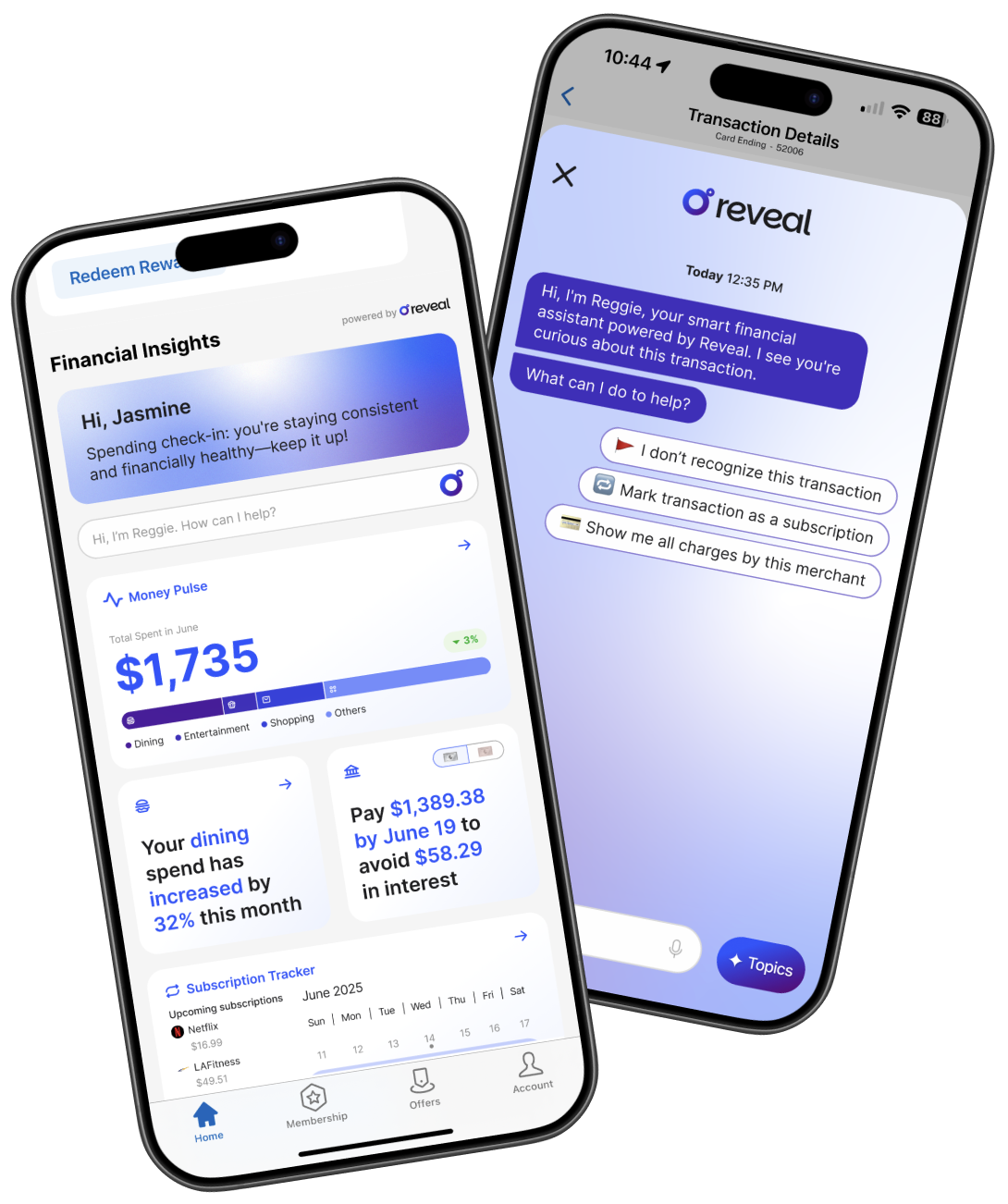
Money Pulse — Personalized financial insights delivered through customizable widgets, helping users understand spending patterns, trends, and monthly activity at a glance.
Reggie AI Assistant — A conversational chatbot that helps users understand transactions, verify charges, and quickly access relevant billing information.
Subscription Tracker — A centralized view of recurring payments and subscriptions, helping users identify, monitor, and manage ongoing expenses more effectively.
Together, these features addressed the three core user needs: understanding spending behavior, verifying unfamiliar charges, and staying in control of recurring expenses.
Step 4 - Branding and UI Design
Before designing the experience, we established the product's visual identity by defining the brand, logo, color palette, typography, and design system. This created a consistent foundation for the product and ensured a cohesive experience across all features.
Using the design system, I translated concepts into wireframes and high-fidelity designs, focusing on clarity, usability, and information hierarchy. Special attention was given to making financial information easy to understand while maintaining consistency across the user flow.
Step 5 - User Testing
To evaluate the effectiveness of the proposed designs, we conducted usability testing through Maze. Participants completed key tasks across the three features, allowing us to assess usability, comprehension, and overall user confidence. The findings helped validate our design decisions and identify opportunities for refinement before finalizing the solution.
View User Testing
05 KEY FEATURES
The final solution was built around three core features designed to address the primary user pain points uncovered during research.
Together, these features help users better understand their spending, verify transactions with confidence, and gain greater control over their monthly financial activity.
06 DESIGN DECISION
Key decisions I made…
Decision 1 — Focus on Understanding Spending, Not Budgeting
Many financial tools focus on budgeting and financial planning. Research showed that users' primary challenge was understanding and verifying their existing spending. I chose to focus on financial clarity first, helping users make sense of their transactions before introducing budgeting features.
Decision 2 — Surface Insights Through Widgets Instead of Complex Dashboards
Users wanted quick answers, not extensive financial reports. Rather than creating a data-heavy dashboard, I designed Money Pulse as a widget-based experience that surfaces the most relevant spending insights at a glance while allowing users to personalize what they see.
Decision 3 — Use Conversational AI for Transaction Discovery
Participants frequently relied on Google searches, invoices, and customer support to investigate unfamiliar charges. Instead of adding more filters and navigation layers, I introduced Reggie as a conversational assistant that allows users to ask questions and receive immediate transaction-related answers.
Decision 4 — Make Subscription Tracking a Dedicated Experience
Recurring charges were one of the most common sources of confusion during interviews. Rather than burying subscriptions within transaction history, I created a dedicated Subscription Tracker that gives users visibility and control over recurring payments in one place.
Decision 5 — Prioritize Context Over Raw Transaction Data
Users often recognized purchases through contextual details rather than merchant names alone. This led to a design approach that emphasized spending insights, merchant information, and transaction context instead of simply displaying transaction records.
07 REFLECTIONS
What I learned
Working on Reveal taught me that financial experiences are often designed around transactions, while users think in terms of questions. Users weren't asking, "What did I spend?"—they were asking, "Do I recognize this charge?", "Why is my bill so high this month?", and "What subscriptions am I still paying for?" This shift in perspective pushed me to design around user intent rather than financial data structures.
It also reinforced the value of prioritization: instead of adding more features, the most impactful solutions were the ones that reduced uncertainty, surfaced relevant information at the right moment, and helped users feel more confident and in control of their financial decisions.
Next Project
Made with ❤️ and lots of iced lattes